Dallas Cowboys Logo - Design and History
- Details
- Parent Category: History of Logos
- Category: NFL Logos
- Hits: 22893
The Dallas Cowboys are a professional American football team in the Eastern Division of the National Football Conference (NFC) in the National Football League (NFL). They are headquarterd in the suburb of Frisco, Texas which is a northern suburb of the Dallas metroplex. The team move started to play its home games at Cowboys Stadium in Arlington beginning in the 2009 season, moving from the city of Irving.The Cowboys joined the NFL as a 1960 expansion team. The team's national following might best be represented by its NFL record of consecutive games in front of sold-out stadiums.
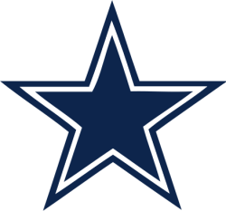
The Dallas Cowboys' blue star logo is associated with the team is one of the best known logos in sports. The blue star originally was a solid shape until a white line and blue border was added in 1964. The logo has remained the same since. Today, the blue star has been extended to not only the Dallas Cowboys, but owner Jerry Jones' AFL team, the Dallas Desperados that have a similar logo based on the Cowboys.
The star has a special place in Texas history as well. The "lone star" is an older symbol predating the flag which was used to symbolize Texans' solidarity in declaring independence from Mexico. It is still seen today as a symbol of Texas' independent spirit, and gave rise to the state's official nickname "The Lone Star State".
Baltimore Ravens Logo - Design and History
- Details
- Parent Category: History of Logos
- Category: NFL Logos
- Hits: 32671
The Baltimore Ravens are a professional American football team based in Baltimore, Maryland. They compete in the AFC North Division of the American Football Conference (AFC) in the National Football League (NFL). The Ravens have won two Super Bowl titles, Super Bowl XXXV, in the 2000 season against the New York Giants. They won again in the 2012-2013 season. The Ravens have been a leading team in the NFL in the last few years having made many playoff appearances in that time. They are known for their tough defence lead by Ray Lewis (who announced his retirement at the end of the 2012-2013 season)
The Ravens were chosen from a Baltimore Sun telephone poll in 1996, the name is borrowed from a well-known poem by Baltimore native Edgar Allen Poe. Poe lived in Baltimore before his death in 1849 and his body is buried in Baltimore. The Ravens logo consists of a mean looking Raven in the team colors of purple and gold with the letter B. The mean looking Raven fits well with the strength of the team - mean defense.
SuperBowl Logos
- Details
- Parent Category: History of Logos
- Category: NFL Logos
- Hits: 27547
The Super Bowl is the championship game of the National Football League (NFL), the highest level of professional American football in the United States, culminating a season that begins in the autumn of the previous calendar year. The Super Bowl uses Roman numerals to identify each game, rather than the year in which it is held. For example, Super Bowl I was played on January 15, 1967, following the regular season played in 1966, while Super Bowl XLV will be played on February 6, 2011, to determine the champion of the 2010 regular season.
The game was created as part of a merger agreement between the NFL and its then-rival league, the American Football League (AFL). It was agreed that the two leagues' champion teams would play in an AFL-NFL World Championship Game until the merger was to officially begin in 1970. After the merger, each league was redesignated as a "conference", and the game was then played between the conference champions.
Shown below are the logos of all the Super Bowl played so far. Each logo represents typically has elements of the game, the Roman Numeral, regional touch among other things. Some of pretty neat and some are quite awful. However, in 2011, the NFL decided that all the logos are going to the standardized and look pretty much the same (read Boring!!!). Enjoy some of the past logos.
|
|
|
|
|
|
|
SuperBowl XLIII |
SuperBowl XLII |
|
|
SuperBowl XL
|
|
SuperBowl XXXIX
|
SuperBowl XXXVIII
|
|
SuperBowl XXXVII |
SuperBowl XXXVI
|
|
SuperBowl XXXV
|
SuperBowl XXXIV
|
|
SuperBowl XXXIII
|
SuperBowl XXXII
|
|
SuperBowl XXXI
|
SuperBowl XXX
|
|
SuperBowl XXIX
|
SuperBowl XXVIII
|
|
SuperBowl XXVII
|
SuperBowl XXVI
|
|
SuperBowl XXV
|
SuperBowl XXIV
|
|
SuperBowl XXIII |
SuperBowl XXII |
|
SuperBowl XXI
|
SuperBowl XX
|
|
SuperBowl XIX
|
SuperBowl XVIII
|
|
SuperBowl XVII
|
SuperBowl XVI
|
|
SuperBowl XV
|
SuperBowl XIV
|
|
SuperBowl XIII
|
SuperBowl XII
|
|
SuperBowl XI
|
SuperBowl X
|
|
SuperBowl IX
|
SuperBowl VIII
|
|
SuperBowl VII
|
SuperBowl IV
|
|
SuperBowl V
|
SuperBowl IV
|
|
SuperBowl III
|
SuperBowl II
|
|
SuperBowl I |
SuperBowl XLVII 2013 Logo Design
- Details
- Parent Category: History of Logos
- Category: NFL Logos
- Hits: 21630
 |
|
Super Bowl XLVII will be the 47th annual edition of the Super Bowl in American football, and the 43rd annual championship game of the modern-era National Football League (NFL). The game, to be played on February 3, 2013, will pit the champions of the AFC, the Baltimore Ravens and the NFC champion, San Francisco 49ers and will be held at Mercedes Benz Superdome in New Orleans, Louisiana. This will be the first time in history that two brothers are head coaches of the respective teams. Hence this event has been unofficially nicknamed, the Harbaugh Bowl or the SuperBaugh.
SuperBowl XLVI will be between the AFC Champions - Baltimore Ravens and the NFC Champions - San Francisco 49ers. |
I am personally not thrilled with this decision by the NFL. If you look at the Super Bowl logos from the past you can see they each had a unique style that represented various aspects of the region, the country, the game etc. Some logos were really well designed and some were cheesy, but that was the fun of it. Going forward, all the logos are going to the equally standardized (read Boring!!!)
See all the SuperBowl Logos here.
See the SuperBowl XLII Logo and the SuperBowl XLI Logo.
New England Patriots Logo - Design and History
- Details
- Parent Category: History of Logos
- Category: NFL Logos
- Hits: 26169
 |
The New England Patriots, commonly called the "Pats", are a professional American football team based in the Greater Boston area, playing their home games in the town of Foxborough, Massachusetts. The team is part of the East Division of the American Football Conference (AFC) in the National Football League (NFL). The team changed its name from the original Boston Patriots after relocating the team to Foxborough in 1971, although Foxborough is a suburb of Boston, 22 miles (35 km) away. For the greater part of the 2000 decade, they have been quite the dominant team led by coach Bill Belichick and quarter-back Tom Brady. The team was named the Patriots because of the area€™s heritage as the birthplace of the American Revolution. |
The Patriots introduced their current logo in the 1993 season when the team underwent a major change in the uniform, colors and logo. The logo is a silhouette of a patriot with the primary colors of the US flag (Red, White and Blue) and a star on the hat. The Patriots logo is also known as the "Flying Elvis" to some because of its slight resemblance to Elvis Presley's long sideburns.
