NBA Logos
New Orleans Pelicans Logo - Design and History
- Details
- Parent Category: History of Logos
- Category: NBA Logos - Design and History
- Hits: 23689
 |
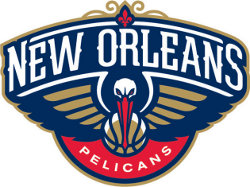
The New Orleans Hornets are a professional basketball team based in New Orleans, Louisiana. They play in the Southwest Division of the Western Conference of the National Basketball Association. The franchise began play during the 1988€“89 NBA season as the Charlotte Hornets, based in Charlotte, North Carolina, where they were located for fourteen seasons. Following the 2001€“02 season, the team relocated to New Orleans, becoming the New Orleans Hornets In January 2013, the Hornets announced that they would change their name to the New Orleans Pelicans from the 2013-14 NBA season. The new name is taken from Louisiana's state bird, the Brown Pelican. With the new name also came a new logo - a menacing pelican holding a basketball in a blue, gold and red color scheme. On closer inspection of the logo, there are a number of distinct elements of the logo and I will discuss the aspects that I have been able to read and pick up on
|
After moving from Charlotte and being displaced for a while, the team may have lost its identify. In order to give the team its identity back, the new logo and name change is warranted and I feel is a good change for the team. The logo is nice and colorful, identifies well with the state and city and certainly a step up from the currently boring white and teal colors of the Hornets. The team has a future superstar in Anthony Davis, who may be a long term player for them. Having his era start with a new branding is a step in the right direction and may be the dawn of a championship winning team.
|
|
 |
Over the years, the New Orleans/Oklahoma City Hornets has gone through some minor modifications buts its essentially been that of a Bee playing basketball. |
The logo depicted on this page is a registered trademark. Use of the logo here does not imply endorsement of the organization by this site.
More NBA Logos
More Sports Logos
More Football Logos
See more World Famous Logos
