Time Warner Digital VOIP Phone - International Calling Plan
 | I have been a fairly early adopter of VOIP offerings in the marketplace
having signed up with Vonage back in 2002. Most of my experience with
them has been good with the occaisional echo problems. I recently moved
to a new location and was very surprised with the International calling
plan that Time Warner cable offered me if I signed up for their Digital
phone service. I was spending over $50 making calls to India and with
Reliance, I would get about 500 minutes of talk time. Time Warner was
offering 3000, yes THREE THOUSAND minutes of calling time to India for
only $20. Of course I had to pay a higher cost for the unlimited long
distance calling ($40/month) but overall it works out cheaper. |
This was not a promotional offer or anything of that nature. So far the experience has been very good. I get through to Indian on the very first try. I have not head issues with echo or packet loss. There are no separate rates for land lines vs cell phones. At this point, I have nothing to complain. The cable modem/VOIP adapter has a built inbattery backup whichis great should you lose power or want to move things around.
Cancelling my service with Vonage was another challenge. They threw all kinds of freebies at my, 1 month free, 2 months free, 3 months free, 1 year unlimited at 14.95 a month.
Does anyone have any experiences with this?
Dabur Logo - Design and History
 |
Dabur India Limited is a leading Indian consumer goods company with interests in health care, Personal care and foods. Over more than a 100 years we have been dedicated to providing nature-based solutions for a healthy and holistic lifestyle. The original logo of the company was the Banyan Tree. The new Dabur identity modernizes the 100-year old equity of the Dabur brand by subtly transforming the tree. While it retains the essence of the banyan tree, it now projects a contemporary image, in consonance with today's lifestyle. The tree, a symbol of nature, is indelibly regarded as a provider of shelter, food and protection. If you observe closely, you will see that the tree trunk mirrors the form for three people with their arms raised conveying exultation in achievement. The broad trunk represents stability and its multiple branches represent growth. |
Brussels Airlines Logo - Design and History
 |
Brussels Airlines is a Belgian airline based at Brussels Airport. It operates to over 50 destinations in 20 European countries, as well as long-haul flights to East, Central and West Africa. Brussels Airlines was created following the merger of SN Brussels Airlines (SNBA) and Virgin Express. |
The logo the letter b in lower case, made up of a series of red elipses.
- The "b" in a contemporary design style, symbolises both Brussels and Belgium.
- In graphic terms, the "b" is made up of a series of ellipses that represent the extended network of the airline, as well as the ground lights on an airport runway.
- The blue is a reminder of the values that are carried forward from SN Brussels Airlines while the red recalls the "low cost" colours of Virgin Express. In the airline sector, blue is generally reassuring and reliable while red is youthful and dynamic.
Most planes have an altered 'b' logo after superstitious travellers complained about the thirteen dots bringing bad luck. The logo now contains fourteen dots.
MySQL Logo - Design and History
 |
MYSQL is a very popular relational database software. The company claims that it has over 10 million installations worldwide. The company agreed to be aquired by Sun Microsystems in January, 2008. MySQL is named after co-founder Monty Widenius's daughter, My. The MySQL logo is a jumping dolphin - symbolizing the speed, power, precision and good nature of the MySQL database and community. The new logo was designed by Renne Angelvuo and his colleagues at Priority Advertising Oy in Helsinki, Finland. |
The name of the MySQL Dolphin is €œSakila,€ which was chosen by the founders of MySQL AB from a huge list of names suggested by users in our €œName the Dolphin€ contest. The winning name was submitted by Ambrose Twebaze, an Open Source software developer from Swaziland, Africa. According to Ambrose, the feminine name Sakila has its roots in SiSwati, the local language of Swaziland. Sakila is also the name of a town in Arusha, Tanzania, near Ambrose's country of origin, Uganda. This site runs on a MySQL database.
SuperBowl XLIV 2010 Logo Design
 |
Super Bowl XLIV will be the 44th annual edition of the Super Bowl in American Professional Football, and the 40th annual championship game of the modern-era National Football League (NFL). The game will be played at Dolphin Stadium in Miami Gardens, Florida. This marks the tenth time a Super Bowl will have played in the South Florida area: five times the game has been held at Dolphin Stadium; the other five were played at the Orange Bowl. The game will be played on February 7, 2010. |
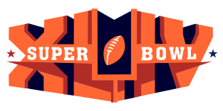
The Logo for the event is shown alongside and the following are some of the key elements in the logo.
1. Clearly the heart of the logo is the XLIV written in block letters.
2. The bold orange color, which really hurts the eye, reflects the Florida Orange
3. The L and I have been somewhat cleverly used to represent the goal post.
4. The two stars on the edges reflect the stars for the two NFL conferences (AFC and NFC). The red star represents the AFC and the blue star represents the NFC.
5. The football is the same as the football in the NFL logo.
I am personally not very impressed by the logo and it seems like that is the general impression of other folks as well. The Orange is too bright and in your face and its really an eye-sore. The block letter too are not very pleasing to the eye. With some other companies like Hertz and Jack in the Box moving to more contemporary fonts, this looks rather old fashioned.
Lets hope that the game is far more interesting than the logo.
See all the SuperBowl Logos here.
See the SuperBowl XLII Logo and the SuperBowl XLI Logo.
SuperBowl XLII Logo Design
 |
SuperBowl XLII is finally upon us, its the undefeated New England Patriots vs the New York Giants. With SuperBowl XLII right around the corner, I thought it would be apt to look at the various SuperBowl logos. The SupwerBowl is the championship game in the NFL and is played between the winner of the National Football Conference (NFC) and the American Football Conference (AFC). The SuperBowl is probably the most watched television event in the United States. |
The SuperBowl logo varies each year and typically has something in it to represent the city where the game is being played. SuperBowl XXI and XXVII were played at the Rose Bowl in Pasadena and so have a touch of rose in the logo.
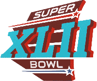
The Super Bowl XLII logo was also unveiled, featuring the shape of the state of Arizona in red. The two horizontal white stripes in the middle represent the vertical lines on the University of Phoenix Stadium. The turquoise Roman Numerals represent the Native American culture of Arizona. The red star represents the AFC and the blue star represents the NFC.
See all the SuperBowl Logos here.