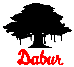
Dabur Logo - Design and History
 |
Dabur India Limited is a leading Indian consumer goods company with interests in health care, Personal care and foods. Over more than a 100 years we have been dedicated to providing nature-based solutions for a healthy and holistic lifestyle. The original logo of the company was the Banyan Tree. The new Dabur identity modernizes the 100-year old equity of the Dabur brand by subtly transforming the tree. While it retains the essence of the banyan tree, it now projects a contemporary image, in consonance with today's lifestyle. The tree, a symbol of nature, is indelibly regarded as a provider of shelter, food and protection. If you observe closely, you will see that the tree trunk mirrors the form for three people with their arms raised conveying exultation in achievement. The broad trunk represents stability and its multiple branches represent growth. |
In India, the tree is a symbol of life. It is a giver of fuel, food and protection. It is a heaven for creatures it generously harbours in its foliage, as well as in the shade of its canopy. The tree is held auspicious as it spreads through the three spheres with its roots meshing through the earth, its trunk rising through the terrestrial world and its branches reaching into the heavens. The leaf is a vital part of a tree. Its functions include the manufacture of food for the plant, transpiration and respiration. A tree full of leaves represents growth, vitality, rejuvenation and renewal. I personally like the logo a lot. It takes the essence of the original logo which was the Banyan tree (very sacred in India) and transforms it into a very modern logo.
 |
The original logo shown alongside is relatively plain. The design of the new logo must have gone through a lot of thought and with Dabur trying to expand their market globally, its a great change in my opinion. |
More Famous India Logos
See more World Famous Logos
Car Logos
Logo Parodies