Rolls Royce Logo - Design and History
- Details
- Parent Category: Travel Logos
- Category: Car Logos - Design and History
- Hits: 64106
The Rolls Royce logo consisting of the two Rs or the double R clearly stands for the Rolls and Royce, the two founders of this car manufacturing company. There is nothing special about the design of the logo, but the brand name is so strong, the logo looks special. In 1998, BMW the option on the trademarks, licensing the name and "RR" logo for £40m.
In 1884 Frederick Henry Royce started an electrical and mechanical business. He made his first car, a "Royce", in his Manchester factory in 1904. He was introduced to Charles Stewart Rolls in a Manchester hotel on the May 4 that year, and the pair agreed a deal where Royce would manufacture cars, to be sold exclusively by Rolls. A clause was added to the contract, stipulating the cars would be called "Rolls-Royce".
Ferrari Logo - Design and History
- Details
- Parent Category: Travel Logos
- Category: Car Logos - Design and History
- Hits: 123696
Mazda Logo - Design and History
- Details
- Parent Category: Travel Logos
- Category: Car Logos - Design and History
- Hits: 29247
Mazda Motor Corporation is a Japanese automotive manufacturer based in Hiroshima, Japan. It is said that Mazda coincides with the anglicized pronunciation of the founder's name, Jujiro Matsuda, who was interested in spirituality, and chose to rename the firm in honor of both his family and Zoroastrianism. The word Mazda derives from Ahura Mazda, the Avestan language name for a divinity exalted by the ancient Iranian prophet Zoroaster, as the source of wisdom, intelligence and harmony.
The current logo attempts to capture the spirit of Mazda, the stylised "M" evokes an image of wings in flight and symbolises the Mazda's flight toward the future. The "V" in the centre of the "M" spreads out like an opening fan, representing the creativity, vitalty, flexibilty and passion that is Mazda. The symbol as a whole expresses the sharp, solid feeling that Mazda will be seeking in all of its products. The dynamic circle symbolises our readiness to spread our wings as we enter the 21st century.
Volvo Logo - Design and History
- Details
- Parent Category: Travel Logos
- Category: Car Logos - Design and History
- Hits: 21147
The Volvo Group is a Swedish supplier of commercial vehicles such as trucks, buses and construction equipment, drive systems for marine and industrial applications, aerospace components and financial services. Volvo was founded on 14 April 1927 in the city of Gothenburg, as a spin-off from the roller ball bearing maker SKF.
The name Volvo means "I roll" in Latin and is derived from the Latin word "volvere" which means "to roll". The name originated from the original company that manufactured bearings for the car industry. The logo for Volvo is the ancient symbol of Iron, which is a circle with an arrow pointed diagonally upwards to the right. This symbol also represented "Mars, the God of War" and also the symbol for "Man" as well. Volvo cars are also traditionally known for the safety features. The iron symbol was used to also reflect the strong tradition of th Swedish Iron Industry along with its properties such as safety, quality and durability. The name of the car "Volvo" also runs across the logo against a blue background.
The Volvo car and brand was sold to Ford in 1999.
Abarth Logo - Design and History
- Details
- Parent Category: Travel Logos
- Category: Car Logos - Design and History
- Hits: 21551
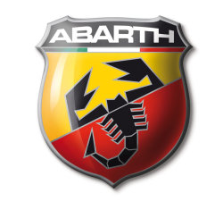
Abarth is an Italian racing car maker founded by Italian-Austrian Karl (Carlo) Abarth in Turin in 1949. Abarth was sold to Fiat on July 31 1971, and the racing team sold to Enzo Osella. Abarth became the racing department of Fiat, managed by famed engine designer Aurelio Lampredi.
The Abarth logo consists of the following key elements
- The shape of the logo represents a shield which symbolizes the notion of victory. You can find some of the other racing logos like Porsche also have a shield in their logo.
- The red, white and green represent the colors of the Italian Flag.
- The scorpion is the key part of the logo and represents the astrological sign of Karl Alberto Abarth who was born on November 15th 1908.
- The red and yellow colors apparently represent the racing world.
