Asian Paints Logo - Design and History
Asian Paints is an Indian chemicals company headquartered in Mumbai, India. It manufactures a wide range of paints for decorative and industrial use. It is India's largest and Asia's third largest paint company, with a turnover of Rs 96.32 billion. It is also one of the largest paint companies in the world and operates in 17 countries. Besides Asian Paints, the group operates around the world through its subsidiaries Berger International Limited, Apco Coatings, SCIB Paints and Taubmans. Asian Paints was founded in 1942 and has over 5200 stores.
Life OK Channel Logo - Design and History
 |
Life OK is an Indian cable and satellite television channel, owned by STAR TV.The channel replaced STAR Network's youth-oriented channel, STAR One. The channel was launched on December 18, 2011. Life OK TV Channel is introduced as General Hindi Entertainment Channel for Hindi TV serials and Shows. Life Ok is promoted by Madhuri Dixit. She became the narrator of the Channel. The logo of the channel is fairly interesting. It takes the letters 'O' and 'K' from OK and adjusts them to look like a stick figure that shows its arms wide open. I suppose its meant to represent that its a channel for everyone. The face and the font is in a bright pink color while the body looks like a mild orange. I am not sure why this re-branding was done because it breaks away its relationship with the Star Network. The stick figure logo could probably be used for some animation. The pink letters are also too bright in my opinion. Very ordinary logo and very ordinary name. I would never have thought this is a name of a TV channel by looking at the logo. |
Zee TV Logo - Design and History
 |
|
Zee TV is an India-based satellite television channel owned by Zee Entertainment Enterprises based in Mumbai, Maharashtra, which broadcasts various programmes in Hindi and other regional languages of India. Broadcasting is also present in various nations of South Asia, Europe, the Middle East, Africa, East Asia, Australasia and North America. It is a part of the Essel Group. In June 2011, Zee TV unvelied a more stylish and contemporary logo shown above. The new logo of Zee TV is designed in an aqua blue color, featuring a stylish font. The design of the new logo of Zee with its upward flourish represents the upward movement of desires and wishes. The aqua blue color of the Zee TV new logo bring in modernity and freshness to the brand. The new logo of Zee tv has been developed by the Zee in-house team. According to MD & CEO Punit Goenka, "The unshackling of the 'Z' from the box symbolizes the modern woman's zest for life and the confidence she possesses to step out into the world, beyond her home. The overall design has a progressive feel and reflects the idea of looking into the future with hope, depicting a more dynamic and spirited outlook. The rainbow of hope is an important element of the new packaging. It is colorful, ethereal and symbolically emphasizes the promise of 'Umeed Se Saje Zindagi'" said ZEEL managing director and chief executive officer Punit Goenka. |
Bharti Airtel Logo - Design and History
 |
| Bharti Airtel is the world's fifth largest telecommunication company and has more than 150 million users in India, 40 million in Africa and another 10 million in Bangladesh and Sri Lanka. In November 2010, Airtel said its subscriber base has crossed the 200 million mark and unveiled a new logo to mark the achievement. The logo as shown alongside is a modern representation of the letter 'a' on a bright red background. Here are some notes and comments from Bharti on their design
|
- The logo has been designed by creative agency JWT
- The entire re-branding campaign has apparently cost the company close to Rs 300-Crore
- A new theme tune, composed by A.R Rehman has also been released
New Delhi Commonwealth Games 2010 Logo Design
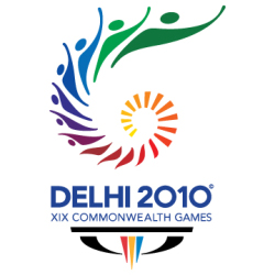 |
The 2010 Commonwealth Games are scheduled to be held in New Delhi, India between 3 October and 14 October 2010. I happened to stumble upon the logo and wanted to find the meaning behind the various elements in the logo. You can clearly see that the logo is inspired by the Chakra. The Chakra is the national symbol of freedom, unity and power and is also found on the Indian Flag. The Chakra spiralling upwards apparently depicts the growth of India into a proud, vibrant nation. As the Chakra emerges, you can also see the the elements in the Chakra turn into people, which I suppose represents everyone involved in the games from the athletes, organizers and the host nation. The games also are going to promote a "Green" theme which may be why the Chakra ends in green. The entire logo also appears to be in the shape of a torch and flame (it may be my imagination). |
The bottom of the logo has a tagline of "Come out and play" which is an invitation to everyone to get involved and participate to the best of their abilities in the true spirit of the games. Also at the bottom of the logo, you can find a three-pointed structure which is the logo of the Commonwealth Games Foundation (CGF) also known as the Bar and the 'W'. The three points of the "W" stand for Humanity, Equality and Destiny. The CGF logo strives to express the core values of the Commonwealth itself, which seeks to unify humanity, promote equality and give all athletes a chance to realise their destiny at the Commonwealth Games.
The color palette for Games 2010 logo bring together two of the idiosyncratic colors of the Commonwealth Games Emblem. Some of the colors widely used in the Commonwealth Games 2010 logo are:
Green: The tint that represents verve, vigor and energy also symbolize the fact that CWG 2010 will be the foremost Green Games. With high-spirits the color motivates to move in a forward direction, encountering every challenge and conquering obstacles with vivacity and zest.
Purple: Merging the unwavering and soothing facets of blue with the magical features of pink, this color gratifies the desire for encouragement, while adding a tinge of ambiguity and thrill.
Red, Yellow & Blue: Symbolizing the 'Trinity of Values', these three Commonwealth Games colors coalesce compassion (Red), endorsing parity (Blue) and providing various prospects to the sportspersons to comprehend their fates (Yellow).
Pink: This color has been used in the CWG color palette to include a component of revelation and opulence to the Games logo. The color truly symbolizes the magnificent beauty of India and its enthusiastic crowd.
Overall I like the logo and it has an Indian touch to it. It may be too big with the tag line and everything else but the core logo is really pretty.
Also see the Bangalore Airport Logo
Bharti Enterprise Logo - Design and History
 |
Bharti Enterprises is one of India€™s leading business groups with interests in telecom, agri business, financial services and retail. Bharti has been a pioneering force in the telecom sector with many firsts and innovations to its credit. Bharti Airtel Limited, a group company, is one of India€™s leading private sector providers of telecommunications services with over 80 million customers as of end of October 2008, spanning Mobile services, Telemedia services and Enterprise services. Bharti Airtel Limited has been voted as India's most innovative company, in a survey conducted by The Wall Street Journal. In November 2008, Bharti Enterprise unveiled a new logo. Bharti said that with the new logo, the group aims to get a facelift with fresh and youthful brand logo which reflects a multi-dimensional character that seeks out new avenues to grow. Revealing the choice of colors for the new logo, the group said that the colour Indigo blue signifies Depth and Orange stands for Youthful Passion and Energy, the Arrowheads stand for Movement that Extends over Boundaries and symbolises Swiftness, Precision and Accuracy. |
Bharti Enterprises has unveiled its new brand identity with a new logo and a vision to become "India's finest conglomerate" by 2020. Bharti aims to achieve this by creating 'Big Transformations through Brave Actions', which is its new slogan.
