Asian Paints Logo - Design and History

Asian Paints is an Indian chemicals company headquartered in Mumbai, India. It manufactures a wide range of paints for decorative and industrial use. It is India's largest and Asia's third largest paint company, with a turnover of Rs 96.32 billion. It is also one of the largest paint companies in the world and operates in 17 countries. Besides Asian Paints, the group operates around the world through its subsidiaries Berger International Limited, Apco Coatings, SCIB Paints and Taubmans. Asian Paints was founded in 1942 and has over 5200 stores.
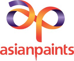
In September 2012, Asian Paints unveiled a new brand identify and logo at a function in Mumbai. The existing logo was about 10 years old and the new identity was born after an extensive consumer survey was completed in some major cities across India. Some of the elements of the new logo are described below.
- At the heart of the new logo, is the ribbon which flows to create the lower case letters 'a' and 'p'
- The ribbon's design is meant to highlight the easy flow, smoothness, dynamism and possibility that their solutions and offerings will provide
- The ribbon has bright colours red, orange and purple giving it a nice contemporary feel
- The word 'asianpaints' with the 'p' shown with some dripping paint it still retained from the previous logo but unlike its predecessor, the term paints is in red not yellow
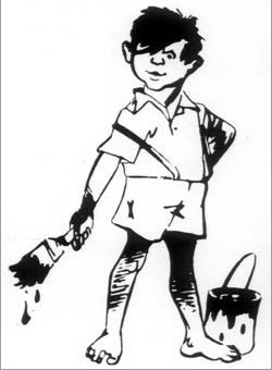
The new logo was unveiled by Soha Ali Khan. The Pataudi family has been associated with this brand for many years. The company also launched a branded home painting service called "Asian Paints Home Solutions". The launch makes no mention of any updates to Gattu, the impish boy who has been the mascot of the company. Gattu was designed by R.K. Laxman in 1954 (good to know for any trivia contest).
Growing up in India, whenever we painted our flat, Asian Paints was the paint of choice so the brand and Gattu will always remain in my mind. Its nice to see that the company is emphasising that a good brand matters and are investing in it.
|
Asian Paints Logo - until 2012 |
Gattu - Asian Paints Mascot |
More Famous India Logos
See more World Famous Logos
Car Logos
Logo Parodies

