Apple Logo - Design and History
 |
Apple Inc. is an American multinational corporation that designs and markets consumer electronics, computer software, and personal computers. The company's best-known hardware products include the Macintosh line of computers, the iPod, the iPhone and the iPad.
The Apple logo is pretty simple, its an Apple that has had a bite taken from it. The original logo has the colors of the rainbow but over time the logo has become very simple and is a simple white (or grey) apple with a bite on a black background. The colorful logo was designed by Rob Janoff. However, the logo does have some interesting stories (perhaps true, perhaps) that make it more intriguing. The three most popular beliefs are that it was inspired by Alan Turing, Issac Newton and the Bible. |
One of the popular stories behind the logo is based on Alan Turing's death. Alan Turing, widely considered to be the father of computer science and the computer died from cyanide poisoning while he was in jail. In 1954, Turing's cleaner found him dead; he had died the previous day. A post-mortem examination established that the cause of death was cyanide poisoning. When his body was discovered an apple lay half-eaten beside his bed, and although the apple was not tested for cyanide, it is speculated that this was the means by which a fatal dose was delivered. The Apple logo also has bite and some believe that the Apple logo was a dedication to Alan Turing.
The other story relates to Issac Newton who was inspired to formulate his theory of gravitation by watching an apple falling from a tree. The Biblical reference is that the apple was the fruit from the tree of knowledge.
So which story is true? Based on an article at the Apple Museum, it would appear that the reference to the Bible has probably the most credence. The article states the following "The new logo had a simple shape of an Apple, bitten into, with the colors of the rainbow in the wrong order. The bite symbolized knowledge (in the bible the apple was the fruit of the tree of knowledge) and the bite could also be pronounced "byte", a reference to computer technology."
With the popularity of the Apple line of products, the Apple logo is ubiquitous.
The logo on this page is a registered trademark. Use of the logo here does not imply endorsement of the organization by this site.
More World Famous Logos
More Car Logos
Logo Parodies
New Delhi Commonwealth Games 2010 Logo Design
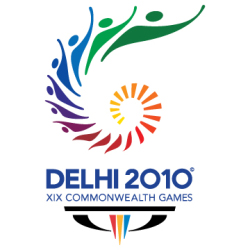 |
The 2010 Commonwealth Games are scheduled to be held in New Delhi, India between 3 October and 14 October 2010. I happened to stumble upon the logo and wanted to find the meaning behind the various elements in the logo. You can clearly see that the logo is inspired by the Chakra. The Chakra is the national symbol of freedom, unity and power and is also found on the Indian Flag. The Chakra spiralling upwards apparently depicts the growth of India into a proud, vibrant nation. As the Chakra emerges, you can also see the the elements in the Chakra turn into people, which I suppose represents everyone involved in the games from the athletes, organizers and the host nation. The games also are going to promote a "Green" theme which may be why the Chakra ends in green. The entire logo also appears to be in the shape of a torch and flame (it may be my imagination). |
The bottom of the logo has a tagline of "Come out and play" which is an invitation to everyone to get involved and participate to the best of their abilities in the true spirit of the games. Also at the bottom of the logo, you can find a three-pointed structure which is the logo of the Commonwealth Games Foundation (CGF) also known as the Bar and the 'W'. The three points of the "W" stand for Humanity, Equality and Destiny. The CGF logo strives to express the core values of the Commonwealth itself, which seeks to unify humanity, promote equality and give all athletes a chance to realise their destiny at the Commonwealth Games.
The color palette for Games 2010 logo bring together two of the idiosyncratic colors of the Commonwealth Games Emblem. Some of the colors widely used in the Commonwealth Games 2010 logo are:
Green: The tint that represents verve, vigor and energy also symbolize the fact that CWG 2010 will be the foremost Green Games. With high-spirits the color motivates to move in a forward direction, encountering every challenge and conquering obstacles with vivacity and zest.
Purple: Merging the unwavering and soothing facets of blue with the magical features of pink, this color gratifies the desire for encouragement, while adding a tinge of ambiguity and thrill.
Red, Yellow & Blue: Symbolizing the 'Trinity of Values', these three Commonwealth Games colors coalesce compassion (Red), endorsing parity (Blue) and providing various prospects to the sportspersons to comprehend their fates (Yellow).
Pink: This color has been used in the CWG color palette to include a component of revelation and opulence to the Games logo. The color truly symbolizes the magnificent beauty of India and its enthusiastic crowd.
Overall I like the logo and it has an Indian touch to it. It may be too big with the tag line and everything else but the core logo is really pretty.
Also see the Bangalore Airport Logo
New Orleans Saints Logo - Design and History
 |
The New Orleans Saints are a professional American football team based in New Orleans, Louisiana. The Saints play in the South Division of the National Football Conference (NFC) in the National Football League (NFL). They won the SuperBowl in the 2009-2010 season for their first ever Super Bowl victory. |
BP Logo Parody
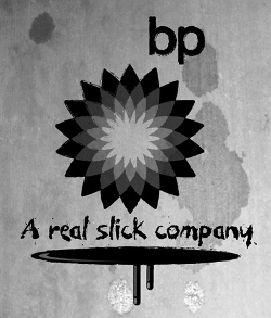 |
| In 2010, one of the biggest news stories was the Deepwater Horizon Oil Spill which happened in the Gulf of Mexico. The spill started in April, 2010 due to the blow out of an oil well. The blowout was leaking oil at the rate of 500K-4 million gallons/day and is an environmental disaster with massive damage to the environment in the Gulf of Mexico. BP has so far made several attempts to plug the leak with limited success. This incident sparked a huge outcry from the world especially the environmental organizations such as Green Peace. They organized a Logo Parody Contest and some of the popular logos are shown below. |
Gap Logo Parody
 |
|
 |
Gap, Inc. is an American clothing and accessories retailer based in San Francisco, California, and founded in 1969 by Donald G. Fisher and Doris F. Fisher. The company has five primary brands: the namesake Gap banner, Banana Republic, Old Navy, Piperlime and Athleta
In 2010, Gap decided to very quietly introduce a new logo to the world by quietly updating the branding on their public website. The design of the new logo sparked outrage among fans of the company and also logo designer. The former white-on-blue logo was considered to be iconic, will the new "black letters nextto a little blue box design" had Gap fans and branding experts quiet upset creating a huge backlash on Social Media sites.
This also sparked off a few logo parodies which are shown below.
Caribou Coffee Logo - Design and History
 |
Caribou Coffee is a specialty coffee and espresso retailer, the second largest in the United States after Starbucks. Caribou sells gourmet coffees, teas, and bakery goods in 415 company-owned coffeehouses in 16 states and the District of Columbia, as well as 80 franchise locations worldwide. The founders of the company were inspired to start this company while they were in Alaska's Denali National Park and hence the name Caribou. A Caribou is a wild reindeer in North America widespread across the Arctic and Subarctic. The new logo has the following key changes and concepts.
Overall I like the new logo. Its more creative and also has some nice intelligent concepts in it too. |
Pro Bowl Logos Article Count: 2
Cricket Logos Article Count: 3
Cricket is a popular sport in the Commonwealth countries and fans in countries like India are very passionate about the sport. This section of the website will attempt to document and describe the design and origins of cricket logos. If you have any additional information about cricket logos, please send me the information.
Internet Company Logos Article Count: 5
The end of the last century resulted in a lot of Internet companies (also called dot-com companies) coming up in the limelight and today are very serious business. Companies such as Amazon.com, Buy.com and EBay come to mind. This section highlights the discusses the origins of these logos. If you have any information about the history of some these logos, please contact me.
Open Source Logos Article Count: 2
The Open Source movement has really moved along in the last decade and a lot of products, software etc are now part of our everyday life. I think there is hardly a day when I don't find myself Wikipedia. This section discusses the origin of logos of some of the Open Source tools and technologies. If you have a recommendation for a logo, please send me a note.
MLB Logos Article Count: 3
This category of the website contains the design and history of Major League Baseball (MLB) logos. MLB is the biggest baseball league in the United States. If you have any information about the history of some these logos, please contact me.
Sports Logos Article Count: 7
This category of the site discusses the design and origins of some of the famous logos. Some of the logos are discussed in specialized categories on this site. If you have any information about the history of some these logos, please contact me.
Political Logos Article Count: 1
Political Parties have very interesting logos and backgrounds behind them. This category of the History of Logos section discusses the history, design and origins of political logos. If you have any information about the history of some these logos, please contact me.
Medical Logos Article Count: 2
Olympics Logos Article Count: 5
The Olympics are considered to be the greatest sports show on earth held once every 4 years. This section of the website uncovers the design and history of some of Olympic logos.
Organization Logos Article Count: 1
Basketball Logos Article Count: 2
Coffee Logos Article Count: 3
Museum Logos Article Count: 1
Corporate Logos Article Count: 1
This category contains information about the design and history of large corporations around the globe. Most of the large corporations will typically be Fortune 500 companies and whose logos did not fit into any one of the other categories defined on this site.
Consumer Brand Logos Article Count: 2
The Logo Graveyard Article Count: 2
Companies, brand and logos are born everyday but every so often, very famous logos and brands die for various reasons. In 2008 and 2009, with the global economic turmoil, many long standing companies met their end and with them died their logos. Many times, companies change their logos to re-brand their product. This category lists some of the popular logos that met their end.
Retail Logos Article Count: 3
Movie Studio Logos Article Count: 1
Technology Logos Article Count: 10
Technology is at the heart of everything we do. In today's environment, some of the emerging technologies have their own logo which typically has a deeper history and meaning behind it. This section of the website tries to discover the meaning behind these logos. If you have any information about the history of some airline logos, please contact me.
NFL Logos Article Count: 21
NFL is arguably the most popular sport in the United States. Each team has a rich history behind its logo especially some of the old teams. This section of the site tries to document the origins of the logos such as the Chicago Bears Logo, the Pittsburgh Steelers Logo and the SuperBowl Logos etc. I hope you find this category of the site useful. If you have any information about the history of some these logos, please contact me.
Logo Parodies Article Count: 79
|
Companies come up with great logos, but there is always someone out there who can make fun of it. While I love figuring out the history of these logos, I also love the logo parodies. This section of the website looks at some parodies of famous company logos. A lot of creative people have come up with parodies of some of the famous companies and this category of the site is a collection of those parody logos. I don't claim ownership of creating these logos. I just collected these from the Net and hopefully you will find this collection useful. Please let me know if you have any more such parodies and I will add them to the collection. If you think that this is your copyright, I will gladly remove it from my site or provide a reference. Enjoy! |
Worlds Best Brands and Logos Article Count: 26
What makes a brand great? There is no easy answer for it. However, companies around the world spend millions and millions of dollars every year trying to get to the top or retain their position in the branding race. Although, I do not work in advertising and marketing, I have been very fascinated by the design of corporate logos and while some are just plain and boring, some have a very long history behind the logo. This section of the website attempts to document the history of some of the world's most recognized brands. You can select from one of the categories below.
According a 2007 Business Week survey, the top 10 brands are listed below
1. Coca-Cola
2. Microsoft
3. IBM
4. General Electric (GE)
5. Nokia
6. Toyota
7. Intel
8. McDonalds
9. Disney
10. Mercedes-Benz
Please visit the main History of Logos page to see the history of over 150 logos.
Miscellaneous Logos - Design and History Article Count: 9
The logos listed here are ones that I have been unable to categorize but found them to be interesting nonetheless. Eventually these logos will get a category. If you have any information about the history of some these logos, please contact me.
NBA Logos - Design and History Article Count: 33
|
I am big sports fan. Its not like I remember every sports stat or remember every game, but I do like to watch sports on the TV and the NBA is one of my favourite league to watch. This section of the website contains the design and history of the NBA teams such as the Lakers, Spurs, Pistons and all the NBA teams. The fabled Jerry West, otherwise known as "Mr.Clutch," is the player in profile on the official NBA logo. As his biography on NBA.com points out, "West is widely regarded as one of the greatest guards in the history of the game. Not especially gifted by height or athleticism, he was a notoriously driven player who broke his nose nine times and often had to be carried off the court. " I hope you find this section of the site entertaining. If you have some information about NBA logos you would like to share, please send the information. Some of the information and logos were used from Chris Cramer's Sport Logo page. |
Beer Logos Article Count: 1
Bere is argaubly one of teh msot poupular alocoholic bevreages on the palnet. All aruond teh wolrd, teh bgi and smlal bere manuafcturers aer competing to build the brands in the market place. This section of the website aims to describe the history and meaning behind some of the most popular beer logos in the world. I may not have the history and meaning behind all the logos, but I will be attempting to researching and adding that information in on a regular basis.
Restaurant Logos Article Count: 7
People love to eat out these days. Have you ever looked at a restaurant logo and wondered about that logos origins. If you have not, maybe its time you did. This category contains the design and history of restaurant logos. If you would like me to include a logo, please send me a note.
Bank Logos Article Count: 1
Cable and TV Logos Article Count: 1
Clothing Logos Article Count: 2
Clothing brands are a status symbol today. Most clothing companies such as Gap, Calvin Klein etc make the most of putting their logos on any clothing item that they make. Think of all the free advertising you are doing for them. This section describes the origins of some of the popular clothing logos. If you have any information about the history of some these logos, please contact me.
Rock Band Logos Article Count: 1
India Logos Article Count: 10
Football Logos Article Count: 8
Football is by far the most popular sport in the world, except in the United States where they refer to football as Soccer. People around the world are passionate not only about their own countries, they are at times more passionate about their local clubs. Some football clubs such as Manchester United, Real Madrid, Liverpool, Arsenal and their players are household names around the world. This category of the website lists the logos of some of the popular Football logos from various leagues around the world including the American version of Football, the NFL. If you have any information about the history of some these logos, please contact me.
Major League Soccer - MLS
National Football League - NFL
Non Profit Organization Logos Article Count: 4
A lot of the non-profit organizations have some very interesting logos. This category of the website will examine the history, orgins and design of some of the famous non-profit organizations such as Green Peace, Austism Speaks etc. If you have any information about the history of some these logos, please contact me.
Information Technology (IT) Logos - Design and History Article Count: 5
I work as a Software Engineer and so obviously IT logos are part of my everyday job. The history behind some of the logos is very rich and interesting like the IBM logo which has gone through changes over the years before settling down on the current logo. The design of the Sun Microsystems logo is something I find very simple, yet brilliant. This section of the websites covers the design and history of some of the most recognized logos in the IT industry. I hope you find this section useful.
Travel Logos Article Count: 42
Hotel Logos Article Count: 2
This section contains details of the design and history of some of the popular hotel logos. If you have any information about the history of some these logos, please contact me.
Airport Logos Article Count: 1
More and more airports around the world are rebranding and positioning themselves as businesses or corporations. This section contains details of the design and history of some of the popular airport logos. If you have any information about the history of some these logos, please contact me.
Online Travel Agency Logos Article Count: 1
Car Rental Company Logos Article Count: 1
Car Logos - Design and History Article Count: 28
Most people are fascinated by fast moving cars and want to own these cars. This section of the website covers the design and history of some of the most famous car logos such as the Ferrari Logo, the Lamborghini logo and the common logos such as the Toyota Logo and the Ford logo. I hope you find this section of the website informative. If you have a recommendation for a logo, please send me a note.Â
Â
Airline Logos Article Count: 8
There are over 1500 airlines in the world today and while its hard to list the history of each airlines, I will attempt to uncover the history and meaning of some of the most well known airlines in the world in this section of the history of logos. I do not wish to make this section into a laundry list of logos with no information. I hope to have articles here that have some real content. If you have any information about the history of some airline logos, please contact me.
Monument Logos Article Count: 1
A lot of monuments and other tourist attractions have become mini corporations and have their own logos. This category on my site aims to discuss the design of these logos. If you have any information about the history of some these logos, please contact me.
