JC Penney Logo - Design and History
 |
|
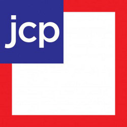
J. C. Penney Company, Inc. is a chain of American mid-range department stores based in Plano, Texas, a suburb north of Dallas. The company operates over 1100 department stores in all 50 U.S. states and Puerto Rico. JC Penney has been in business for over 75 years now and is one of the most widely recognized brands in the United States. In Jan 2012, JC Penney unveiled a new logo, shown alongside to go with their new policy of more standardize pricing, which they called "Fair and Square". The new logo and rebranding effort comes just a year after their last rebranding effort. The main aspects of the logo as below - the letters 'jcp' now appear in a blue box on top of a red square frame. In the previous design, the 'jcp' was in a red frame next to the 'enny' which was in a white box and looked a bit odd. Separating the 'jcp' makes it clear. |
The new logo design does not excite me at all. Adding the blue into the mix take away focus from the logo. There is a lot of white space that is wasted in the logo as well. While the new logo may look OK in print or on a website, I am not sure how they would update their stores with this logo.
The reactions to the logo have been mainly negative but only time will tell if the new branding and the pricing model were effective.
Pro Bowl 2012 Logo Design
The Pro Bowl is the all-star game of the National Football League (NFL). Since the merger with the rival American Football League (AFL) in 1970, it has been officially called the AFC-NFC Pro Bowl, matching the top players in the American Football Conference (AFC) against those in the National Football Conference (NFC). Currently, players are voted into the Pro Bowl by the coaches, the players themselves, and the fans.The Pro Bowl has been played in Hawaii since 1970 except for 2009 when it was held in Miami. The 2012 game will be held in Hawaii as well and will be played on Jan 29th, 2012, a week before Super Bowl XVI.
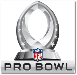
The Pro Bowl logo, just like the Super Bowl logo has been standarized in 2011 and has taken the same black & white steel feel to it. The logo consists of the following key elements
- The logo is in the shape of the Pro Bowl trophy, which is basically the shape of a football.
- There are 4 stars on each side representing the 4 conferences in the AFC (AFC North, AFC South, AFC East, AFC West) and the NFC (NFC North, NFC South, NFC East, NFC West)
- The only non black and white element of the logo is the colorful NFL logo at the bottom of the trophy.
SuperBowl XLVI 2012 Logo Design
 |
Super Bowl XLVI will be the 46th annual edition of the Super Bowl in American football, and the 42st annual championship game of the modern-era National Football League (NFL). The game, to be played on February 5, 2012, will pit the champions of the AFC and the NFC and will be held at Lucas Oil Stadium in Indianapolis, Indiana. This will be the first time that the Super Bowl will be held in Indianapolis. SuperBowl XLVI will be between the AFC Champions - New England Patriots and the NFC Champions - New York Giants. |
I am personally not thrilled with this decision by the NFL. If you look at the Super Bowl logos from the past you can see they each had a unique style that represented various aspects of the region, the country, the game etc. Some logos were really well designed and some were cheesy, but that was the fun of it. Going forward, all the logos are going to the equally standardized (read Boring!!!)
See all the SuperBowl Logos here.
See the SuperBowl XLII Logo and the SuperBowl XLI Logo.
Hyatt Hotel Logo - Design and History

Hyatt House is an extended stay hotel brand of the Hyatt group. Extended stay hotels are a type of lodging with features unavailable at standard hotels. These features are intended to provide more home-like amenities. Extended-stay hotels typically have self-serve laundry facilities and offer discounts for extended stays, beginning at 5 or 7 days. They also have suites with kitchens.
Hyatt House will be the new brand name of the all Hyatt Summerfield Suite hotels in addition to the ones acquired from LodgeWorks.
The logo is fairly simple and contemporary and comprises of the following elements.- The 'H' is both in lower case and uppercase
- The lowercase 'h' is in the shape of a bed while
- The uppercase H has a curved square flag in a bold blue hue. Blue is the base color of the Hyatt brand which helps it stay connected to the brand yet have its own distinctive identity.
The name Hyatt House was selected as an identifier that signals a residential, welcoming, personal and hospitable experience. Hyatt House also has historical significance as the name of the first Hyatt hotel, which opened in 1957 at Los Angeles Airport LAX.
This video gives you an insight into the new hotel room design and features.
See more World Famous Logos
Technology Logos
Car Logos
Logo Parodies
 |  |
Belkin International, Inc., is a manufacturer of computer hardware that specializes in connectivity devices, headquartered in Playa Vista, Los Angeles, California. Belkin sells in both the consumer and the commercial business-to-business (B2B) market, with various product lines including routers, iPod and iPhone accessories, mobile computing accessories, surge protectors, switches, hubs and other peripherals. Belkin has become one of the fastest growing companies in the world, with over 1,000 employees and sales topping $1 billion. They are primarily in the connectivity business.
In 2012, Belkin unveiled a new brand identity at the 2012 International Consumer Electronics Show (CES) in Las Vegas.
The logo comprises of the following elements
- The logo utlizes a series of dots of various sizes to create the image of a person. That design is in line with their philosophy of taking inspiration from people. The connect the dots theme also goes well with connecting with people.
- The new logo is also called PIP, People Inspired Products
- The font for Belkin has changed to a lower case font and more contemporary as some others have done recently such as Seattle's Best Coffee and Jack in the Box.
The new logo is a huge change from their current logo which is just the word BELKIN in a simple font. The new logo could be used in interesting ways in their products such as putting it in front of an LED and lighting up the logo. I think it will look cool in a dark room. Imagine a rack full of shining blue people with REM's "Shiny Happy People" playing in the background..
The logo was design by Wolff Olins.
Their chief brand officer put out the following Press Release as well. "The new Belkin logo, affectionately named PIP for People Inspired Products, symbolizes our commitment to take inspiration from people, and acknowledges the connection between people and the experiences they value most. In a future where connectedness will only increase, our products have one common goal, to ensure that technology exists to serve people, and never the other way around." - Chief Brand Officer Ernesto Quinteros
Washington Wizards Logo - Design and History
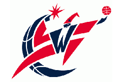 |
The Washington Wizards are a professional basketball team based in Washington, D.C., previously known as Washington Bullets. They play in theNational Basketball Association (NBA), and play their home games at the Verizon Center in the Chinatown section of Washington, D.C.
The new logo also uses the red, white and blue colors whereas the previous logo had light blue, brown and black. Certain aspects of the logo have been made sharper and the wizard also appears to be at a different angle. |
Pro Bowl Logos Article Count: 2
Cricket Logos Article Count: 3
Cricket is a popular sport in the Commonwealth countries and fans in countries like India are very passionate about the sport. This section of the website will attempt to document and describe the design and origins of cricket logos. If you have any additional information about cricket logos, please send me the information.
Internet Company Logos Article Count: 5
The end of the last century resulted in a lot of Internet companies (also called dot-com companies) coming up in the limelight and today are very serious business. Companies such as Amazon.com, Buy.com and EBay come to mind. This section highlights the discusses the origins of these logos. If you have any information about the history of some these logos, please contact me.
Open Source Logos Article Count: 2
The Open Source movement has really moved along in the last decade and a lot of products, software etc are now part of our everyday life. I think there is hardly a day when I don't find myself Wikipedia. This section discusses the origin of logos of some of the Open Source tools and technologies. If you have a recommendation for a logo, please send me a note.
MLB Logos Article Count: 3
This category of the website contains the design and history of Major League Baseball (MLB) logos. MLB is the biggest baseball league in the United States. If you have any information about the history of some these logos, please contact me.
Sports Logos Article Count: 7
This category of the site discusses the design and origins of some of the famous logos. Some of the logos are discussed in specialized categories on this site. If you have any information about the history of some these logos, please contact me.
Political Logos Article Count: 1
Political Parties have very interesting logos and backgrounds behind them. This category of the History of Logos section discusses the history, design and origins of political logos. If you have any information about the history of some these logos, please contact me.
Medical Logos Article Count: 2
Olympics Logos Article Count: 5
The Olympics are considered to be the greatest sports show on earth held once every 4 years. This section of the website uncovers the design and history of some of Olympic logos.
Organization Logos Article Count: 1
Basketball Logos Article Count: 2
Coffee Logos Article Count: 3
Museum Logos Article Count: 1
Corporate Logos Article Count: 1
This category contains information about the design and history of large corporations around the globe. Most of the large corporations will typically be Fortune 500 companies and whose logos did not fit into any one of the other categories defined on this site.
Consumer Brand Logos Article Count: 2
The Logo Graveyard Article Count: 2
Companies, brand and logos are born everyday but every so often, very famous logos and brands die for various reasons. In 2008 and 2009, with the global economic turmoil, many long standing companies met their end and with them died their logos. Many times, companies change their logos to re-brand their product. This category lists some of the popular logos that met their end.
Retail Logos Article Count: 3
Movie Studio Logos Article Count: 1
Technology Logos Article Count: 10
Technology is at the heart of everything we do. In today's environment, some of the emerging technologies have their own logo which typically has a deeper history and meaning behind it. This section of the website tries to discover the meaning behind these logos. If you have any information about the history of some airline logos, please contact me.
NFL Logos Article Count: 21
NFL is arguably the most popular sport in the United States. Each team has a rich history behind its logo especially some of the old teams. This section of the site tries to document the origins of the logos such as the Chicago Bears Logo, the Pittsburgh Steelers Logo and the SuperBowl Logos etc. I hope you find this category of the site useful. If you have any information about the history of some these logos, please contact me.
Logo Parodies Article Count: 79
|
Companies come up with great logos, but there is always someone out there who can make fun of it. While I love figuring out the history of these logos, I also love the logo parodies. This section of the website looks at some parodies of famous company logos. A lot of creative people have come up with parodies of some of the famous companies and this category of the site is a collection of those parody logos. I don't claim ownership of creating these logos. I just collected these from the Net and hopefully you will find this collection useful. Please let me know if you have any more such parodies and I will add them to the collection. If you think that this is your copyright, I will gladly remove it from my site or provide a reference. Enjoy! |
Worlds Best Brands and Logos Article Count: 26
What makes a brand great? There is no easy answer for it. However, companies around the world spend millions and millions of dollars every year trying to get to the top or retain their position in the branding race. Although, I do not work in advertising and marketing, I have been very fascinated by the design of corporate logos and while some are just plain and boring, some have a very long history behind the logo. This section of the website attempts to document the history of some of the world's most recognized brands. You can select from one of the categories below.
According a 2007 Business Week survey, the top 10 brands are listed below
1. Coca-Cola
2. Microsoft
3. IBM
4. General Electric (GE)
5. Nokia
6. Toyota
7. Intel
8. McDonalds
9. Disney
10. Mercedes-Benz
Please visit the main History of Logos page to see the history of over 150 logos.
Miscellaneous Logos - Design and History Article Count: 9
The logos listed here are ones that I have been unable to categorize but found them to be interesting nonetheless. Eventually these logos will get a category. If you have any information about the history of some these logos, please contact me.
NBA Logos - Design and History Article Count: 33
|
I am big sports fan. Its not like I remember every sports stat or remember every game, but I do like to watch sports on the TV and the NBA is one of my favourite league to watch. This section of the website contains the design and history of the NBA teams such as the Lakers, Spurs, Pistons and all the NBA teams. The fabled Jerry West, otherwise known as "Mr.Clutch," is the player in profile on the official NBA logo. As his biography on NBA.com points out, "West is widely regarded as one of the greatest guards in the history of the game. Not especially gifted by height or athleticism, he was a notoriously driven player who broke his nose nine times and often had to be carried off the court. " I hope you find this section of the site entertaining. If you have some information about NBA logos you would like to share, please send the information. Some of the information and logos were used from Chris Cramer's Sport Logo page. |
Beer Logos Article Count: 1
Bere is argaubly one of teh msot poupular alocoholic bevreages on the palnet. All aruond teh wolrd, teh bgi and smlal bere manuafcturers aer competing to build the brands in the market place. This section of the website aims to describe the history and meaning behind some of the most popular beer logos in the world. I may not have the history and meaning behind all the logos, but I will be attempting to researching and adding that information in on a regular basis.
Restaurant Logos Article Count: 7
People love to eat out these days. Have you ever looked at a restaurant logo and wondered about that logos origins. If you have not, maybe its time you did. This category contains the design and history of restaurant logos. If you would like me to include a logo, please send me a note.
Bank Logos Article Count: 1
Cable and TV Logos Article Count: 1
Clothing Logos Article Count: 2
Clothing brands are a status symbol today. Most clothing companies such as Gap, Calvin Klein etc make the most of putting their logos on any clothing item that they make. Think of all the free advertising you are doing for them. This section describes the origins of some of the popular clothing logos. If you have any information about the history of some these logos, please contact me.
Rock Band Logos Article Count: 1
India Logos Article Count: 10
Football Logos Article Count: 8
Football is by far the most popular sport in the world, except in the United States where they refer to football as Soccer. People around the world are passionate not only about their own countries, they are at times more passionate about their local clubs. Some football clubs such as Manchester United, Real Madrid, Liverpool, Arsenal and their players are household names around the world. This category of the website lists the logos of some of the popular Football logos from various leagues around the world including the American version of Football, the NFL. If you have any information about the history of some these logos, please contact me.
Major League Soccer - MLS
National Football League - NFL
Non Profit Organization Logos Article Count: 4
A lot of the non-profit organizations have some very interesting logos. This category of the website will examine the history, orgins and design of some of the famous non-profit organizations such as Green Peace, Austism Speaks etc. If you have any information about the history of some these logos, please contact me.
Information Technology (IT) Logos - Design and History Article Count: 5
I work as a Software Engineer and so obviously IT logos are part of my everyday job. The history behind some of the logos is very rich and interesting like the IBM logo which has gone through changes over the years before settling down on the current logo. The design of the Sun Microsystems logo is something I find very simple, yet brilliant. This section of the websites covers the design and history of some of the most recognized logos in the IT industry. I hope you find this section useful.
Travel Logos Article Count: 42
Hotel Logos Article Count: 2
This section contains details of the design and history of some of the popular hotel logos. If you have any information about the history of some these logos, please contact me.
Airport Logos Article Count: 1
More and more airports around the world are rebranding and positioning themselves as businesses or corporations. This section contains details of the design and history of some of the popular airport logos. If you have any information about the history of some these logos, please contact me.
Online Travel Agency Logos Article Count: 1
Car Rental Company Logos Article Count: 1
Car Logos - Design and History Article Count: 28
Most people are fascinated by fast moving cars and want to own these cars. This section of the website covers the design and history of some of the most famous car logos such as the Ferrari Logo, the Lamborghini logo and the common logos such as the Toyota Logo and the Ford logo. I hope you find this section of the website informative. If you have a recommendation for a logo, please send me a note.Â
Â
Airline Logos Article Count: 8
There are over 1500 airlines in the world today and while its hard to list the history of each airlines, I will attempt to uncover the history and meaning of some of the most well known airlines in the world in this section of the history of logos. I do not wish to make this section into a laundry list of logos with no information. I hope to have articles here that have some real content. If you have any information about the history of some airline logos, please contact me.
Monument Logos Article Count: 1
A lot of monuments and other tourist attractions have become mini corporations and have their own logos. This category on my site aims to discuss the design of these logos. If you have any information about the history of some these logos, please contact me.
Main Menu
Most Popular Articles
- Nike Logo - Design and History
- McDonalds Logo - Design and History
- Toyota Logo - Design and History
- Ferrari Logo - Design and History
- Chanel Logo Design and History
- Harley Davidson Logo Design and History
- Pepsi Logo - Design and History
- Audi Logo - Design and History
- BMW Logo - Design and History
- Coca Cola Logo - Design and History