Starbucks Logo - Design and History
 |
Starbucks Corporation is a coffeehouse chain based in the United States. Named after a character in the novel Moby Dick, it is the largest coffeehouse company in the world, with over 7500 self-operated and 5500 licensed stores in 39 countries. The current company logo, modeled after a 15th century Norse woodcut, is a mixoparthenos, or "twin-tailed mermaid, or siren as she's known in Greek mythology. The company and the logo have an interesting history. In Jan 2011, Starbucks released a new version of the logo with a couple of big changes and some subtle changes as well. The two major changes made to the logo are
|
2011 ICC Cricket World Cup Logo Design
The 2011 ICC Cricket World Cup will be the tenth Cricket World Cup, and will be hosted by three South Asian Test cricket playing countries; India, Sri Lanka and Bangladesh. It will be Bangladesh's first time co-hosting a Cricket World Cup. The World Cup will use cricket's One Day International format, with fourteen national cricket teams scheduled to compete. The World Cup will take place during the months of February and March 2011, with the first match being played on 19 February 2011.
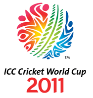
The event has a theme called "Celebration of Cricket" and the logo represents the theme. The logo is in the shape of a cricket ball with an upright green seam and both the sides represent a crowd that is a part of the action, with the hands up, cheering and shouting for their team.
The green seam indicates the one day ball and the green of the pitch and ground. The players and crowd surround this with motion and activity. The colours and figures on each side of the ball represent the event host nations coming together along with the world of cricket. The colour and movement creates a festival, players and fans coming together from around the world to celebrate cricket in the sub-continent.
The logo was unveiled on July 14th in Mumbai and was designed by Australian creative firm Witekite, one of 12 companies from all over the world that submitted concepts. The logo, in the shape of a cricket ball, is intended to reflect all that is best about cricket in the sub-continent - colour, movement and action.
I really love the logo as it represents the energy of the crowds in the sub-continents will bring to the event. The shapes in the logo also have a very Indian touch to it.
Economic Crisis Logos
 | Indian food is among the most popular cuisines around the world and IT in India is among the fastest growing professions as well. Someone had the bright idea of combining the two and the results can be seen below. Some are quite funny especially the interpretation of that MindTree logo shown alongside. |
Yahoo! Logo Parody
 | Yahoo in one of the leading search engines on the web but over the years, not only the search engine but most of the company's other properties have started to "go down the drain" which seems to have inspired this logo. At the end of the 2010, the company laid off about 600 workers. Wonder if they will survive on their own or be forced to sell themselves/ |
Bharti Airtel Logo - Design and History
 |
| Bharti Airtel is the world's fifth largest telecommunication company and has more than 150 million users in India, 40 million in Africa and another 10 million in Bangladesh and Sri Lanka. In November 2010, Airtel said its subscriber base has crossed the 200 million mark and unveiled a new logo to mark the achievement. The logo as shown alongside is a modern representation of the letter 'a' on a bright red background. Here are some notes and comments from Bharti on their design
|
- The logo has been designed by creative agency JWT
- The entire re-branding campaign has apparently cost the company close to Rs 300-Crore
- A new theme tune, composed by A.R Rehman has also been released
Time Warner Cable Logo - Design and History
|
Time Warner Cable 2010 Logo |
Time Warner Cable Old Logo |
Time Warner Cable is an American national cable television company that operates in 27 states and has 31 operating divisions. In an effort to modernize its brand, Time Warner Cable revealed a redesigned logo in October 2010.
Time Warner Cable has kept its iconic eye and ear graphic, though it's emphasis is much more significant than before. In the old design, the symbol was only a small part of a long, rectangular logo. Now, the design is more square-shaped and the ear and eye graphic accounts for nearly half of the overall logo. Additionally, the logo uses a vibrant baby blue instead of the diluted navy color from its previous logo. Also, the word "cable" now holds the same weight as the words "Time Warner," which could indicate the company is putting renewed focus on its cable offerings.
Based on the design changes, I feel that this is not a major rehaul of their logo but small enough to maybe make a difference in the branding.
Some other notes on the logo -
- The new typeface uses a font based heavily on Stag Sans Round by Christian Schwartz
- The national cable company worked with design agency The Brand Union, which is owned by WPP.
Car Logo Parodies
World Famous Logos
More Car Logos
The respective logos are registered trademarks. Use of the logo here does not imply endorsement of the organization by this site.
Pro Bowl Logos Article Count: 2
Cricket Logos Article Count: 3
Cricket is a popular sport in the Commonwealth countries and fans in countries like India are very passionate about the sport. This section of the website will attempt to document and describe the design and origins of cricket logos. If you have any additional information about cricket logos, please send me the information.
Internet Company Logos Article Count: 5
The end of the last century resulted in a lot of Internet companies (also called dot-com companies) coming up in the limelight and today are very serious business. Companies such as Amazon.com, Buy.com and EBay come to mind. This section highlights the discusses the origins of these logos. If you have any information about the history of some these logos, please contact me.
Open Source Logos Article Count: 2
The Open Source movement has really moved along in the last decade and a lot of products, software etc are now part of our everyday life. I think there is hardly a day when I don't find myself Wikipedia. This section discusses the origin of logos of some of the Open Source tools and technologies. If you have a recommendation for a logo, please send me a note.
MLB Logos Article Count: 3
This category of the website contains the design and history of Major League Baseball (MLB) logos. MLB is the biggest baseball league in the United States. If you have any information about the history of some these logos, please contact me.
Sports Logos Article Count: 7
This category of the site discusses the design and origins of some of the famous logos. Some of the logos are discussed in specialized categories on this site. If you have any information about the history of some these logos, please contact me.
Political Logos Article Count: 1
Political Parties have very interesting logos and backgrounds behind them. This category of the History of Logos section discusses the history, design and origins of political logos. If you have any information about the history of some these logos, please contact me.
Medical Logos Article Count: 2
Olympics Logos Article Count: 5
The Olympics are considered to be the greatest sports show on earth held once every 4 years. This section of the website uncovers the design and history of some of Olympic logos.
Organization Logos Article Count: 1
Basketball Logos Article Count: 2
Coffee Logos Article Count: 3
Museum Logos Article Count: 1
Corporate Logos Article Count: 1
This category contains information about the design and history of large corporations around the globe. Most of the large corporations will typically be Fortune 500 companies and whose logos did not fit into any one of the other categories defined on this site.
Consumer Brand Logos Article Count: 2
The Logo Graveyard Article Count: 2
Companies, brand and logos are born everyday but every so often, very famous logos and brands die for various reasons. In 2008 and 2009, with the global economic turmoil, many long standing companies met their end and with them died their logos. Many times, companies change their logos to re-brand their product. This category lists some of the popular logos that met their end.
Retail Logos Article Count: 3
Movie Studio Logos Article Count: 1
Technology Logos Article Count: 10
Technology is at the heart of everything we do. In today's environment, some of the emerging technologies have their own logo which typically has a deeper history and meaning behind it. This section of the website tries to discover the meaning behind these logos. If you have any information about the history of some airline logos, please contact me.
NFL Logos Article Count: 21
NFL is arguably the most popular sport in the United States. Each team has a rich history behind its logo especially some of the old teams. This section of the site tries to document the origins of the logos such as the Chicago Bears Logo, the Pittsburgh Steelers Logo and the SuperBowl Logos etc. I hope you find this category of the site useful. If you have any information about the history of some these logos, please contact me.
Logo Parodies Article Count: 79
|
Companies come up with great logos, but there is always someone out there who can make fun of it. While I love figuring out the history of these logos, I also love the logo parodies. This section of the website looks at some parodies of famous company logos. A lot of creative people have come up with parodies of some of the famous companies and this category of the site is a collection of those parody logos. I don't claim ownership of creating these logos. I just collected these from the Net and hopefully you will find this collection useful. Please let me know if you have any more such parodies and I will add them to the collection. If you think that this is your copyright, I will gladly remove it from my site or provide a reference. Enjoy! |
Worlds Best Brands and Logos Article Count: 26
What makes a brand great? There is no easy answer for it. However, companies around the world spend millions and millions of dollars every year trying to get to the top or retain their position in the branding race. Although, I do not work in advertising and marketing, I have been very fascinated by the design of corporate logos and while some are just plain and boring, some have a very long history behind the logo. This section of the website attempts to document the history of some of the world's most recognized brands. You can select from one of the categories below.
According a 2007 Business Week survey, the top 10 brands are listed below
1. Coca-Cola
2. Microsoft
3. IBM
4. General Electric (GE)
5. Nokia
6. Toyota
7. Intel
8. McDonalds
9. Disney
10. Mercedes-Benz
Please visit the main History of Logos page to see the history of over 150 logos.
Miscellaneous Logos - Design and History Article Count: 9
The logos listed here are ones that I have been unable to categorize but found them to be interesting nonetheless. Eventually these logos will get a category. If you have any information about the history of some these logos, please contact me.
NBA Logos - Design and History Article Count: 33
|
I am big sports fan. Its not like I remember every sports stat or remember every game, but I do like to watch sports on the TV and the NBA is one of my favourite league to watch. This section of the website contains the design and history of the NBA teams such as the Lakers, Spurs, Pistons and all the NBA teams. The fabled Jerry West, otherwise known as "Mr.Clutch," is the player in profile on the official NBA logo. As his biography on NBA.com points out, "West is widely regarded as one of the greatest guards in the history of the game. Not especially gifted by height or athleticism, he was a notoriously driven player who broke his nose nine times and often had to be carried off the court. " I hope you find this section of the site entertaining. If you have some information about NBA logos you would like to share, please send the information. Some of the information and logos were used from Chris Cramer's Sport Logo page. |
Beer Logos Article Count: 1
Bere is argaubly one of teh msot poupular alocoholic bevreages on the palnet. All aruond teh wolrd, teh bgi and smlal bere manuafcturers aer competing to build the brands in the market place. This section of the website aims to describe the history and meaning behind some of the most popular beer logos in the world. I may not have the history and meaning behind all the logos, but I will be attempting to researching and adding that information in on a regular basis.
Restaurant Logos Article Count: 7
People love to eat out these days. Have you ever looked at a restaurant logo and wondered about that logos origins. If you have not, maybe its time you did. This category contains the design and history of restaurant logos. If you would like me to include a logo, please send me a note.
Bank Logos Article Count: 1
Cable and TV Logos Article Count: 1
Clothing Logos Article Count: 2
Clothing brands are a status symbol today. Most clothing companies such as Gap, Calvin Klein etc make the most of putting their logos on any clothing item that they make. Think of all the free advertising you are doing for them. This section describes the origins of some of the popular clothing logos. If you have any information about the history of some these logos, please contact me.
Rock Band Logos Article Count: 1
India Logos Article Count: 10
Football Logos Article Count: 8
Football is by far the most popular sport in the world, except in the United States where they refer to football as Soccer. People around the world are passionate not only about their own countries, they are at times more passionate about their local clubs. Some football clubs such as Manchester United, Real Madrid, Liverpool, Arsenal and their players are household names around the world. This category of the website lists the logos of some of the popular Football logos from various leagues around the world including the American version of Football, the NFL. If you have any information about the history of some these logos, please contact me.
Major League Soccer - MLS
National Football League - NFL
Non Profit Organization Logos Article Count: 4
A lot of the non-profit organizations have some very interesting logos. This category of the website will examine the history, orgins and design of some of the famous non-profit organizations such as Green Peace, Austism Speaks etc. If you have any information about the history of some these logos, please contact me.
Information Technology (IT) Logos - Design and History Article Count: 5
I work as a Software Engineer and so obviously IT logos are part of my everyday job. The history behind some of the logos is very rich and interesting like the IBM logo which has gone through changes over the years before settling down on the current logo. The design of the Sun Microsystems logo is something I find very simple, yet brilliant. This section of the websites covers the design and history of some of the most recognized logos in the IT industry. I hope you find this section useful.
Travel Logos Article Count: 42
Hotel Logos Article Count: 2
This section contains details of the design and history of some of the popular hotel logos. If you have any information about the history of some these logos, please contact me.
Airport Logos Article Count: 1
More and more airports around the world are rebranding and positioning themselves as businesses or corporations. This section contains details of the design and history of some of the popular airport logos. If you have any information about the history of some these logos, please contact me.
Online Travel Agency Logos Article Count: 1
Car Rental Company Logos Article Count: 1
Car Logos - Design and History Article Count: 28
Most people are fascinated by fast moving cars and want to own these cars. This section of the website covers the design and history of some of the most famous car logos such as the Ferrari Logo, the Lamborghini logo and the common logos such as the Toyota Logo and the Ford logo. I hope you find this section of the website informative. If you have a recommendation for a logo, please send me a note.Â
Â
Airline Logos Article Count: 8
There are over 1500 airlines in the world today and while its hard to list the history of each airlines, I will attempt to uncover the history and meaning of some of the most well known airlines in the world in this section of the history of logos. I do not wish to make this section into a laundry list of logos with no information. I hope to have articles here that have some real content. If you have any information about the history of some airline logos, please contact me.
Monument Logos Article Count: 1
A lot of monuments and other tourist attractions have become mini corporations and have their own logos. This category on my site aims to discuss the design of these logos. If you have any information about the history of some these logos, please contact me.

