Adsense Tip 4 - Text Ads vs Text-Image Ads
 |
When Google came up with their text ads, they were very successful because users seemed to click through at a higher rates over image ads. It was my belief that text ads would get a higher click through rate thereby increasing my earnings. In many of my ad settings, I had gone with text only ads but had to reconsider the setting based on the following email I got from the Adsense team. Our system analyzed your domain, dinesh.com, and found that you€™re not opted-in to image ads on at least 50% of the pages of your site. For example, we€™ve found that your 160x600 ad unit on dinesh.com/history_of_logos/worlds_best_brands_and_logos.html is only opted-in to text ads. We recommend that you opt-in to image ads for all of your AdSense ad units. I did change the setting and what I found was that with the image/text setting, my click through rate dropped a bit but my ECPM went up thereby my earnings went up. I would strongly recommend experimenting with this setting. Observe data for a week before and for a week after the change and make a decision. Each site is unique so you may get different results. |
Gap Logo Parody
 |
|
 |
Gap, Inc. is an American clothing and accessories retailer based in San Francisco, California, and founded in 1969 by Donald G. Fisher and Doris F. Fisher. The company has five primary brands: the namesake Gap banner, Banana Republic, Old Navy, Piperlime and Athleta
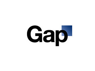
In 2010, Gap decided to very quietly introduce a new logo to the world by quietly updating the branding on their public website. The design of the new logo sparked outrage among fans of the company and also logo designer. The former white-on-blue logo was considered to be iconic, will the new "black letters nextto a little blue box design" had Gap fans and branding experts quiet upset creating a huge backlash on Social Media sites.
This also sparked off a few logo parodies which are shown below.
BP Logo Parody
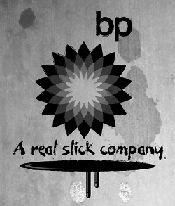 |
| In 2010, one of the biggest news stories was the Deepwater Horizon Oil Spill which happened in the Gulf of Mexico. The spill started in April, 2010 due to the blow out of an oil well. The blowout was leaking oil at the rate of 500K-4 million gallons/day and is an environmental disaster with massive damage to the environment in the Gulf of Mexico. BP has so far made several attempts to plug the leak with limited success. This incident sparked a huge outcry from the world especially the environmental organizations such as Green Peace. They organized a Logo Parody Contest and some of the popular logos are shown below. |
Caribou Coffee Logo - Design and History
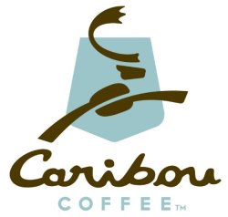 |
Caribou Coffee is a specialty coffee and espresso retailer, the second largest in the United States after Starbucks. Caribou sells gourmet coffees, teas, and bakery goods in 415 company-owned coffeehouses in 16 states and the District of Columbia, as well as 80 franchise locations worldwide. The founders of the company were inspired to start this company while they were in Alaska's Denali National Park and hence the name Caribou. A Caribou is a wild reindeer in North America widespread across the Arctic and Subarctic. The new logo has the following key changes and concepts.
Overall I like the new logo. Its more creative and also has some nice intelligent concepts in it too. |
2010 Vancouver Winter Olympics Logo Parody
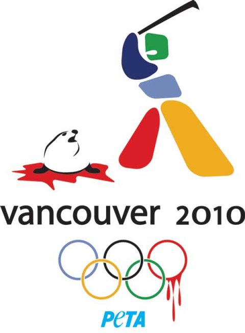
The 2010 Winter Olympics are being held in Vancouver Canada. PETA (People for the Ethical Treatment of Animals) luanched a campaign to protest the annual killing of baby seals in Canada. The parody shows a variation of the actual 2010 Winter Olympics logo shown as a man killing a seal with a hockey stick along with blood on the Olympic rings. PETA planned to sell pins of the logo and post the logo on billboards across Canada.
2010 Mens Final Four Logo
 |
The 2010 NCAA Men's Division I Basketball Tournament involves 65 schools playing in a single-elimination tournament to determine the national champion of men's NCAA Division I college basketball. The event began on March 16, 2010 and will conclude with the championship game on April 5 at Lucas Oil Stadium in Indianapolis, Indiana. The event will also be the first Final Four at Lucas Oil Stadium; the RCA Dome and Market Square Arena hosted past Final Fours when the event was held in Indianapolis. This event is also popularly refererred to as March Madness. |
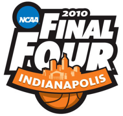
The Logo for the event is shown above and the following are some of the key elements in the logo.
- The logo is pretty simple and contains the event name and location - NCAA 2010 Final Four Indianapolis
- The logo has the orange basketball color.
- The skyline shown has the Lucas Oil Stadium which is the location of the event and the Indianapolis skyline as well.
See the history and design of some NBA Logos.
